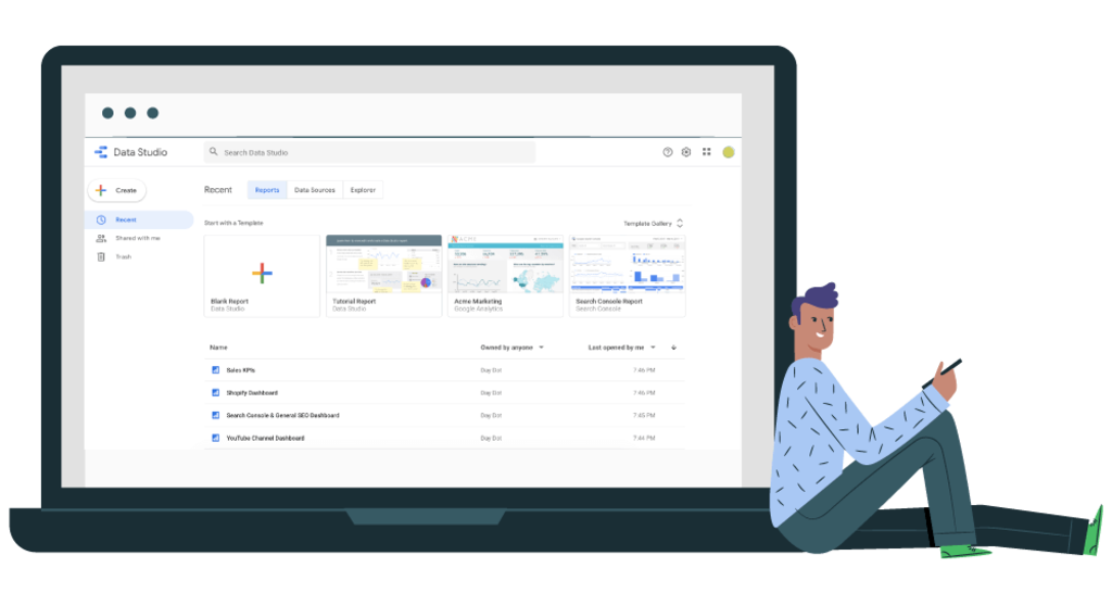
Google Data Studio is a much-underestimated tool when it comes to creating smart and scalable dashboards. The tool developed by Google makes it possible, among other things, to create smart dashboards, offering great interoperability between the different tracking services and excellent visibility for the end user.
Its advantage? Centralize data from your various sources and format them. Google Data Studio allows you to share and give a view to your personalized dashboards (for your customers for example) without giving control of the data. It also allows you to have a synchronous view of the data and therefore to obtain complete and interactive reports with updated data.
With Google Data Studio, it’s the end of the recurring creation of standardized reports: the report aggregates and updates the data in real-time. We will see here step by step, how to handle the tool.
Create a Report

Creating a Data Studio report is simple.
You can create a blank page report by clicking on the “+” logo. Standard models are available by clicking on “all models”. More report templates are available in “Report Gallery”
Select Data Sources

The first thing to do is to determine a common nomenclature for all your data sources. We advise you to indicate at least the data source + the site concerned. Google aggregates more than 120 different data sources, namely around twenty of its own services and more than 100 partner data sources (SEMrush, Adobe Analytics, Facebook Ads, Mailchimp, Twitter, etc.).
To get reliable baseline data on a site’s visibility, it’s a good idea to use data from Google Search Console as a minimum, as well as Google Analytics. Then depending on the sectors and sites, it is interesting to add Digital Marketing Data or Social Media data (Facebook Ads, Twitter, etc.). Once a data source is created in Google Data Studio, you can use it for multiple reports without having to create new data sources.
If the data source has already been created, then all you have to do is link this source to your report. Once each of the sources has been created, we will see how to structure them.
Structure the Data

Google Data Studio has recognized your data sources, it knows where to look for them, it is now necessary to show it what data to represent and how, on your reports.
To present your data, different data visualization formats are available, and there are 11 of them:
- Time series
- Bar chart
- Combo chart
- Pie chart
- Painting
- Geographical summary
- Data table
- Scatter chart
- Bullet charts
- Area chart
- Pivot table
This may not seem like much, but they are customizable at will and can contain a large amount of data. Once the desired format is selected, simply frame the area of the report on which this data will emerge. Once the range of data is on your sheet, it is a question of selecting the different aggregates essential to the representation of your data.
For example, for Google Analytics, it is a question of selecting the affiliated statistic (or metric).
- Data source selection
- Selecting the targeted stat
- It is possible to refine the data by directly selecting a filter, a dimension, and sorting them
The automatic selection of the date range will be based on the “date range” functionality of Google Data Studio, inserting in a sheet, and will come to modify the data of all your sources, in case of modification.
It is advisable to do this if the dashboard is used by a beginner audience who wants to get a quick view of the data.
There is also no need to differentiate between different data ranges if the analyzed site is not based on any seasonality.
It is interesting to vary the different formats on one and the same data.
On this sheet, we note that the traffic data “sessions”, “clicks”, “bounce rate” and “impressions” are represented in the format of “data range”, “time series”, and “table”. The sheet thus makes it possible to correlate in volume and in time.
A report has several “pages”:
To make it easier to get started with Google Data Studio, we advise you at the beginning to use a page per data report from your sources. For example for your first report, using Google Analytics, Search Console and AdWords, it is possible to approach the slips in the following way:
- Audience
- Acquisition
- Behavior
- Conversions
Around these sheets which represent the “central core” of your analysis, it is possible to add specific pages, namely:
- Social Media
- AdWords
- Adobe Analytics
To Go Further… Personalization
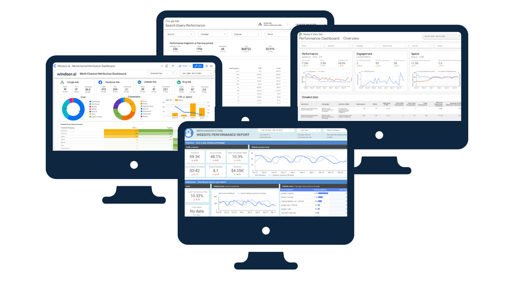
The strong point of Data Studio is the representation of data. To format your data, it is possible to format your reports (the pages) and the data contained in your reports.
Report Formatting
A simple visualization element is to first apply a navigation banner to it. To achieve this formatting, SEO for Journalists can use text locations, the insertion of images (.png included), and the insertion of geometric shapes. These features allow for great customization potential.
As navigation functionalities, we can add the date range selector, which will modify your data according to the date range and will prevail over the data range selected individually on each element of your report.
Data Formatting
Each of the proposed formats has formatting elements.
It’s very simple: a tab to modify the data, a tab to format it. In the example above, here are the elements selected to arrive at the final rendering.
Report Finalization and Sharing
Different functionalities allow sharing and group work on reports.
- Download of the report, in PDF format (since October 2018).
- Make a copy of the report, which allows, among other things, to duplicate it, and to use the report as a template.
- Share this report, which includes sharing the URL of the report and providing a view of it, without modification agreement.
Google Data Studio is therefore a must for any web professional who wants to very quickly create synthetic and easily shareable reports. To benefit from advanced data training and in the creation of intelligent dashboards, contact our e-marketing consultants.
Explore further:

